SDK Manager
Redesigning how brand SDKs get branded and built, in a no-code desktop web app.
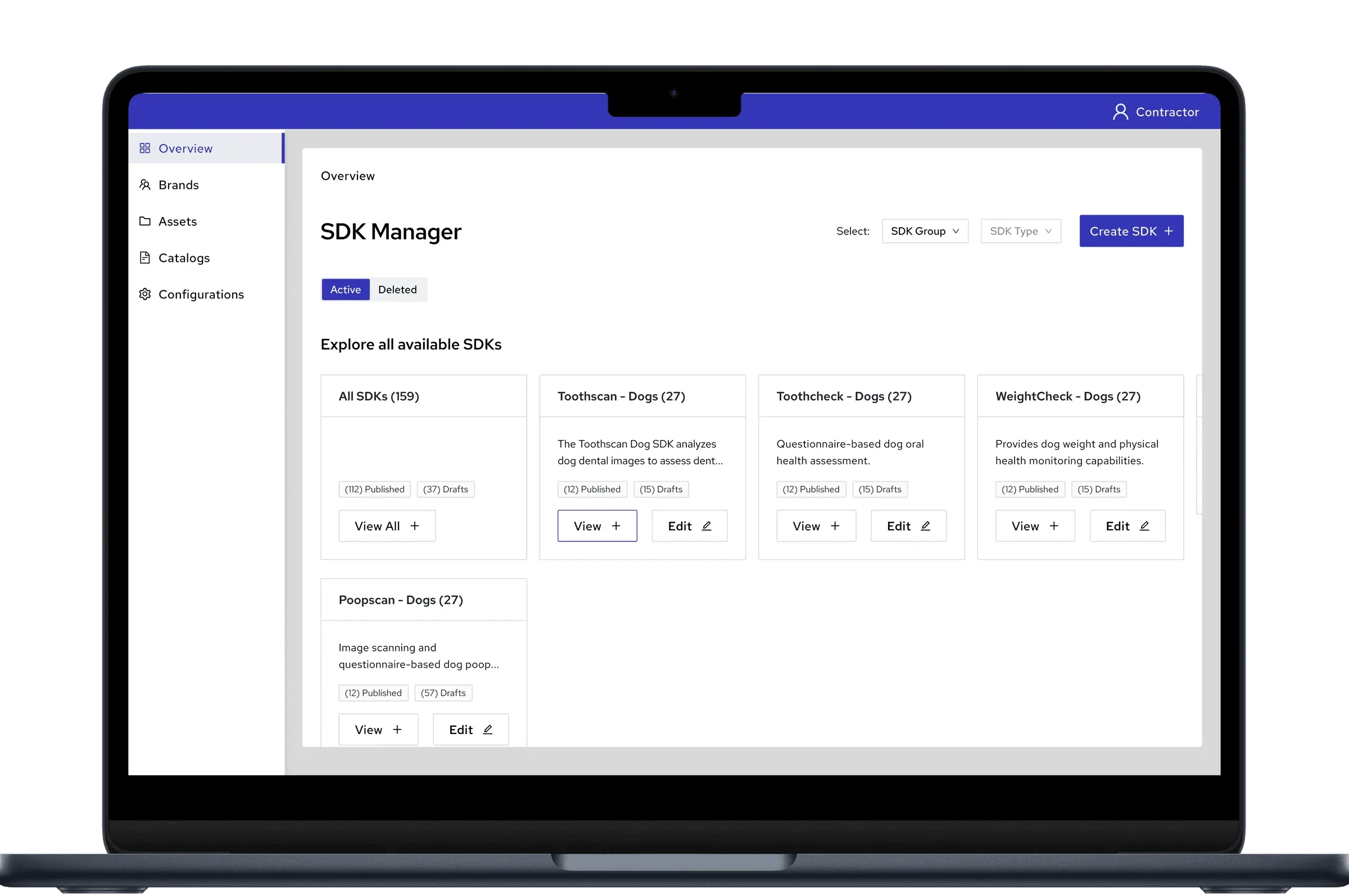
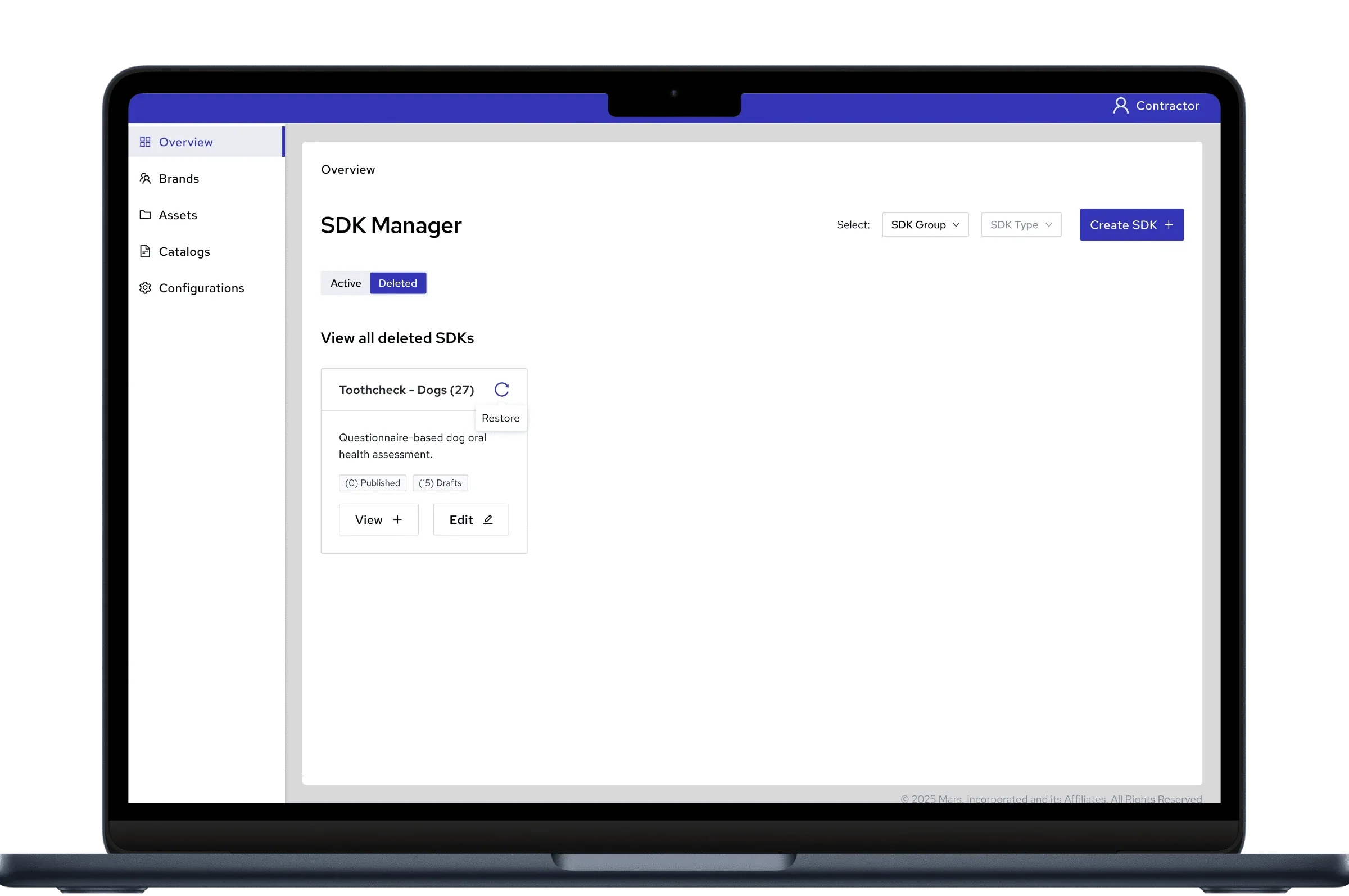
SDK Manager is a no-code platform a global pet-care company uses to build branded SDKs for its brands. An SDK here is the set of screens behind a tool like a pet health scan, typically 23 to 28 screens. The scan and check tools in my Pet Health Scan Suite case study are built here.
Who uses it. The company's brand and technology teams, who create, brand and publish SDKs for each of their brands.
The problem. Before the platform, every SDK was designed and built by hand. It took 2–3 weeks each time, and only 7–8 were ever shipped.
Where I came in. Another designer set the direction and designed the early flows, then handed the product over to me two months after I joined. Since April 2025 I've been the only designer, working with a BA and the engineering team through the Phase 1 launch and into Phase 2.
- Redesigned how branding is assigned to an SDK: 4 steps down to 2, with missed screens flagged before publish. Explored 5 versions.
- Proposed static components: recurring components built once instead of on every screen that uses them. Rejected at first, approved after QA hit the same problem.
What I worked from
There was no direct user research on this project.
- Journey maps. Created before I joined, covering scenarios like building a new SDK and editing an existing one.
- BA reports. From the teams using the platform, including screens being missed during branding.
- QA feedback. From testers building SDKs end to end.
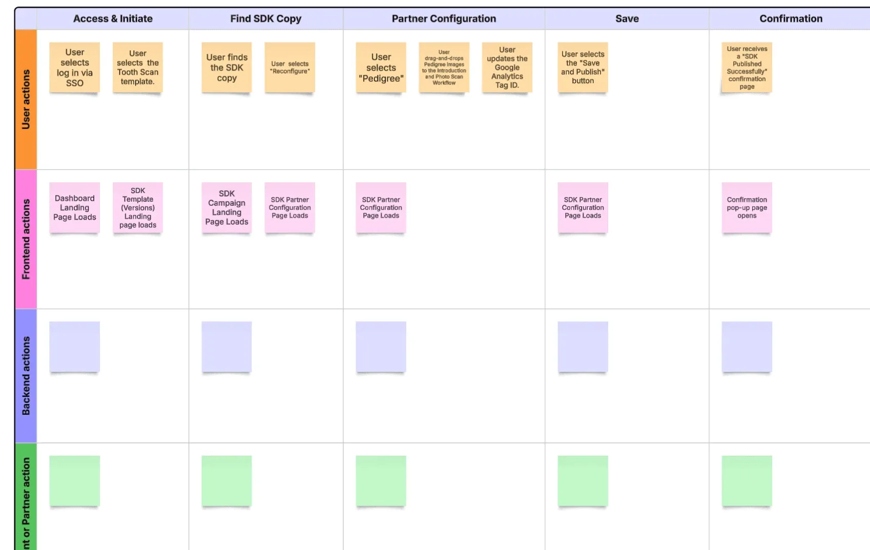
What I inherited
Every SDK version gets one brand, which sets its images, colours, and fonts. In the flow I inherited, this took two screens.
Choosing the brand. Each brand card had a toggle, and the copy said to "individually enable brands," which suggested several could be on at once.
Assigning images. Every screen that needed a brand image sat on one long page, each with its own upload box.
The BA reported that users were missing screens. I traced it to page length: on one long scrolling page, some upload boxes were easy to scroll past, and the gap only showed up later as an error.
What I changed
What I tried and dropped
Five versions in total. Four didn't make it, and each one taught me something about what the final design had to do.
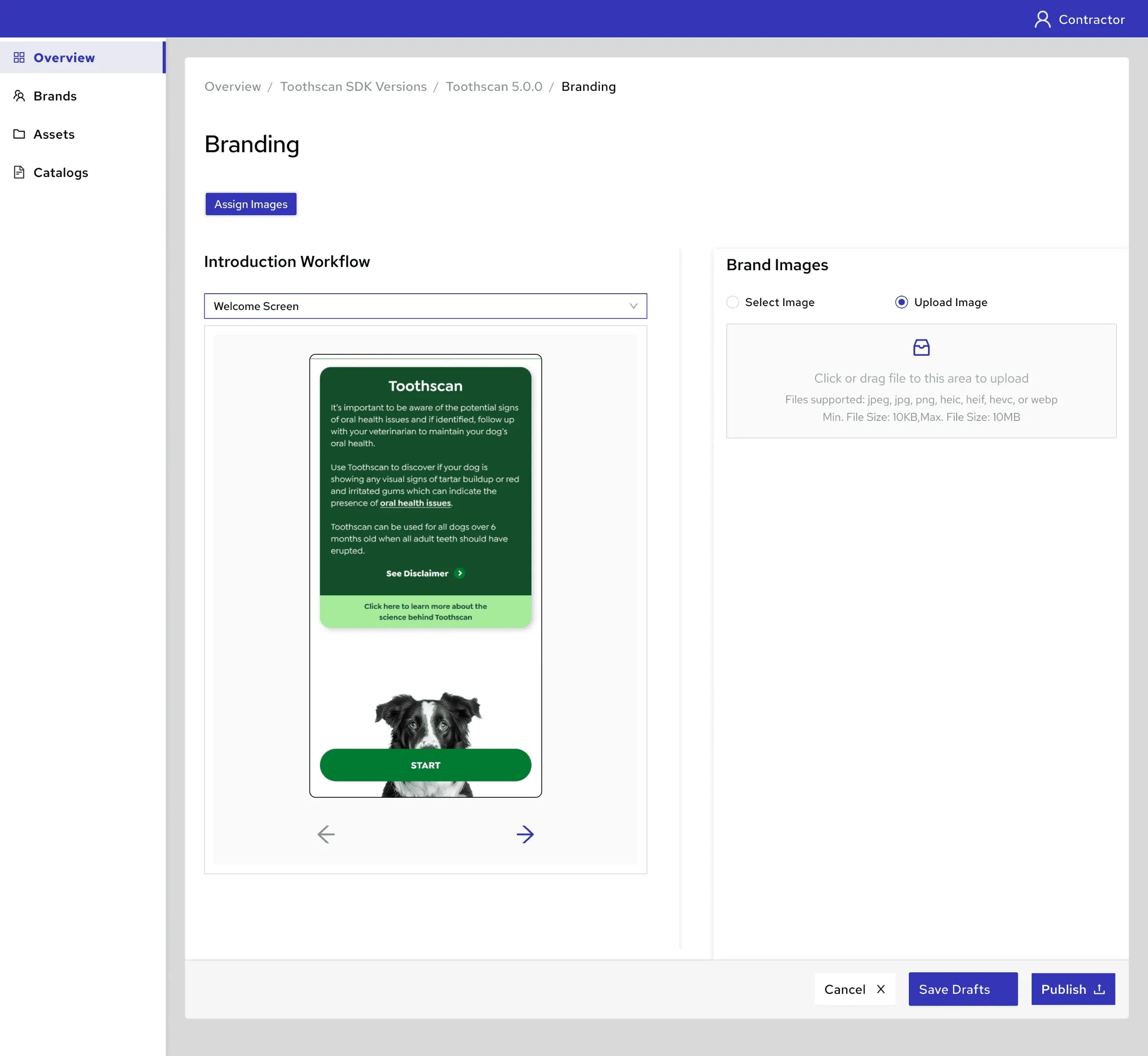
Workflow tabs, one screen at a time
Almost approved. The screens were split into workflow tabs with one preview at a time, so there was no way to see which were done or flag the missing ones.
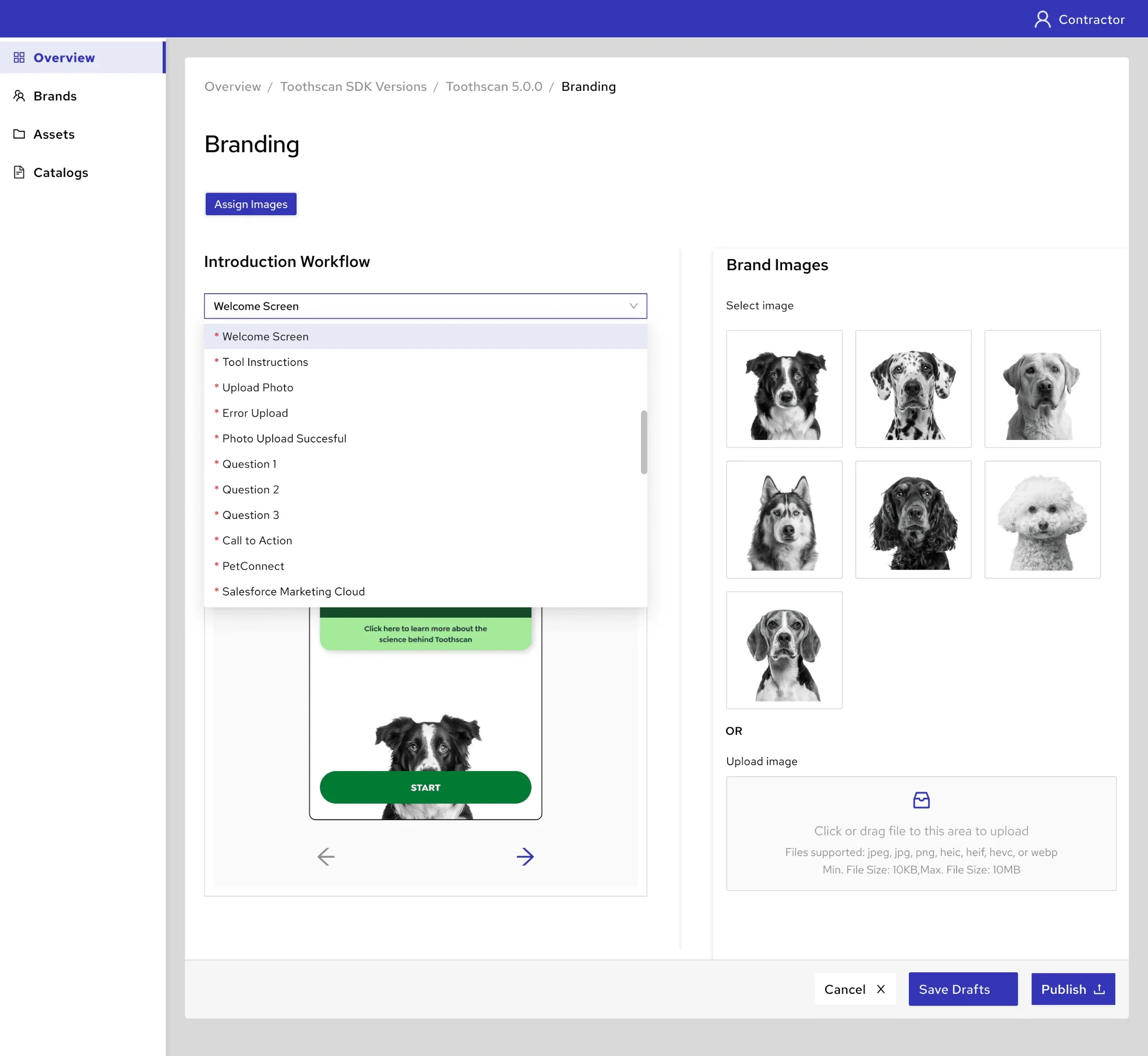
Upload first
Put the upload box above the brand images. Dropped because uploading new images is the less common task.
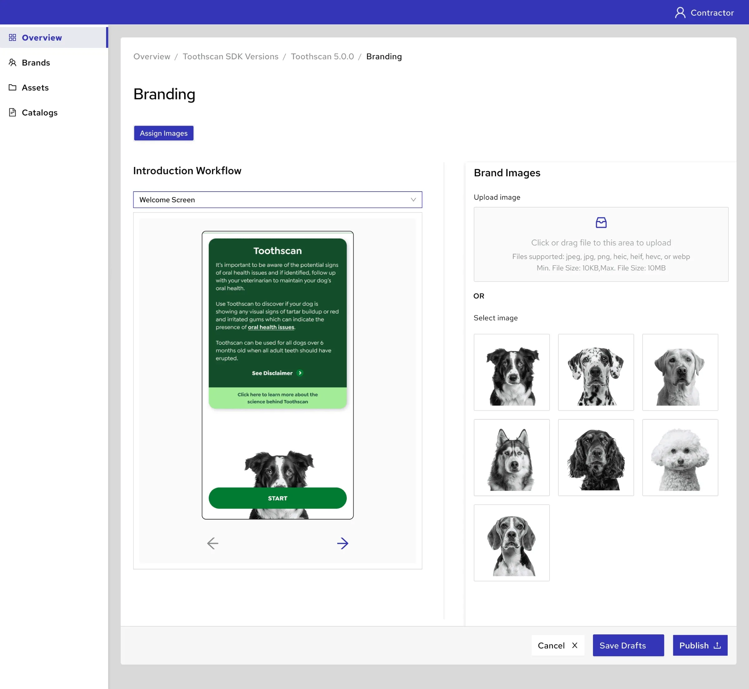
A Select / Upload radio toggle
Kept the panel short, but only one option was visible at a time, so someone who needed to upload could miss the toggle. The final design shows both.
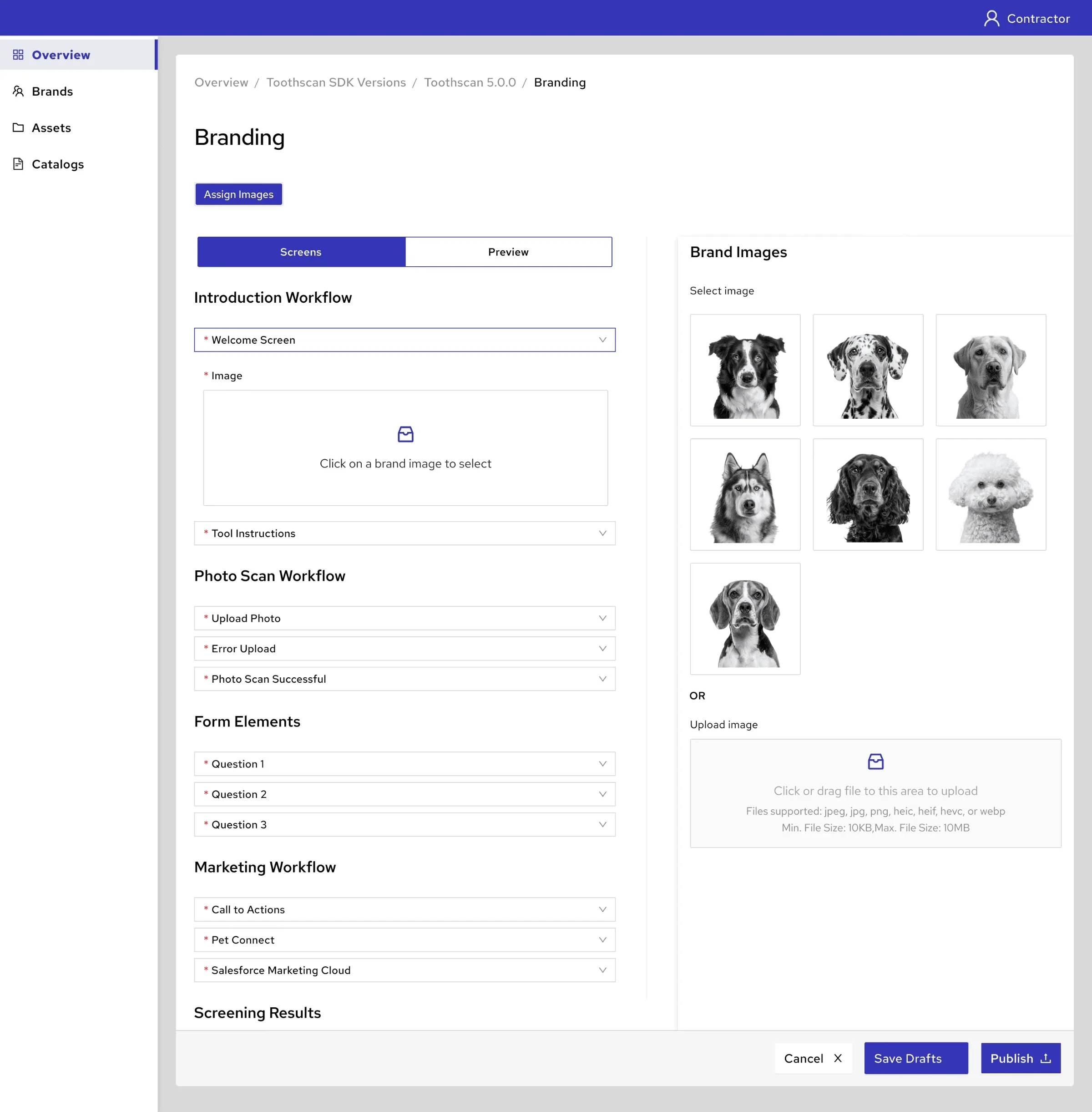
A Screens / Preview split
Mirrored the builder's Sections / Preview pattern, so it would have felt familiar. But the Screens view brought back the long scroll, and switching views added clicks.
steps to choose a brand
Shipped after the Phase 1 release. Image assignment went from one long page to a section-by-section flow where missed screens are flagged before publishing.
Build once, use on every screen
A handful of components appear on nearly every screen: brand header, tool header, feedback forms, result components. The builder had no way to reuse a component, so users rebuilt each of these on every screen that needed it, 18 to 24 of an SDK's 23 to 28 screens. It was slow, and every rebuild was a chance for one screen to drift from the rest.
It took two pitches to get them built
Static components were my idea, and they didn't get built the first time I proposed them.
Result: one edit instead of one per screen
Shipped after the Phase 1 release. Each SDK now has 3 to 5 static components, each built once instead of on 18 to 24 screens. Changing a header is now one edit instead of one per screen.
What I'd change
Measure my own changes from the start. The build-time numbers at the top are for the platform as a whole. For my two changes, I have no tracked time data: the BA's reports told us missed screens stopped, but I can't say how much time the redesign or static components saved. Next time I'd agree one or two metrics with the BA before release.
Other parts of the platform I designed
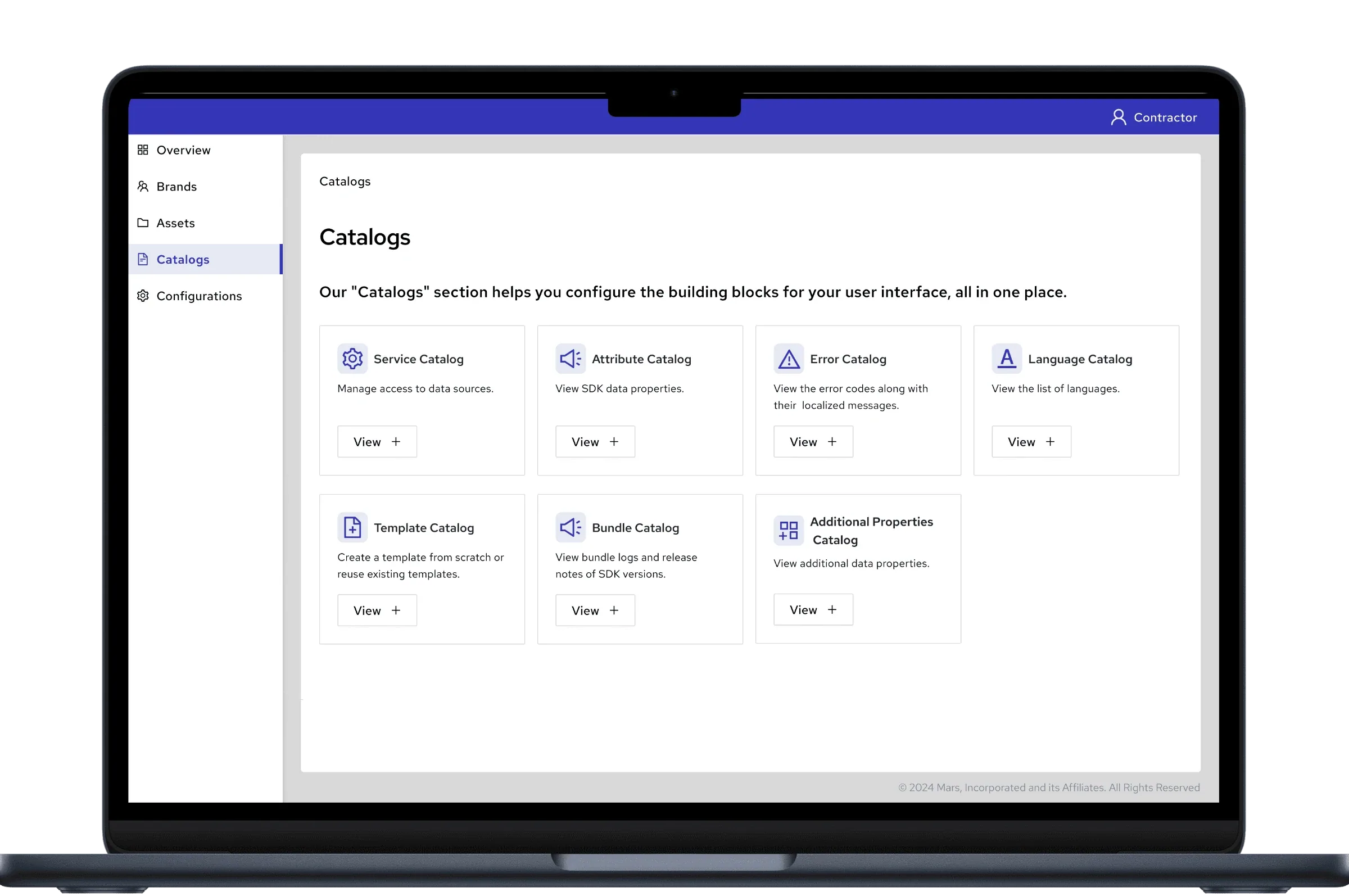
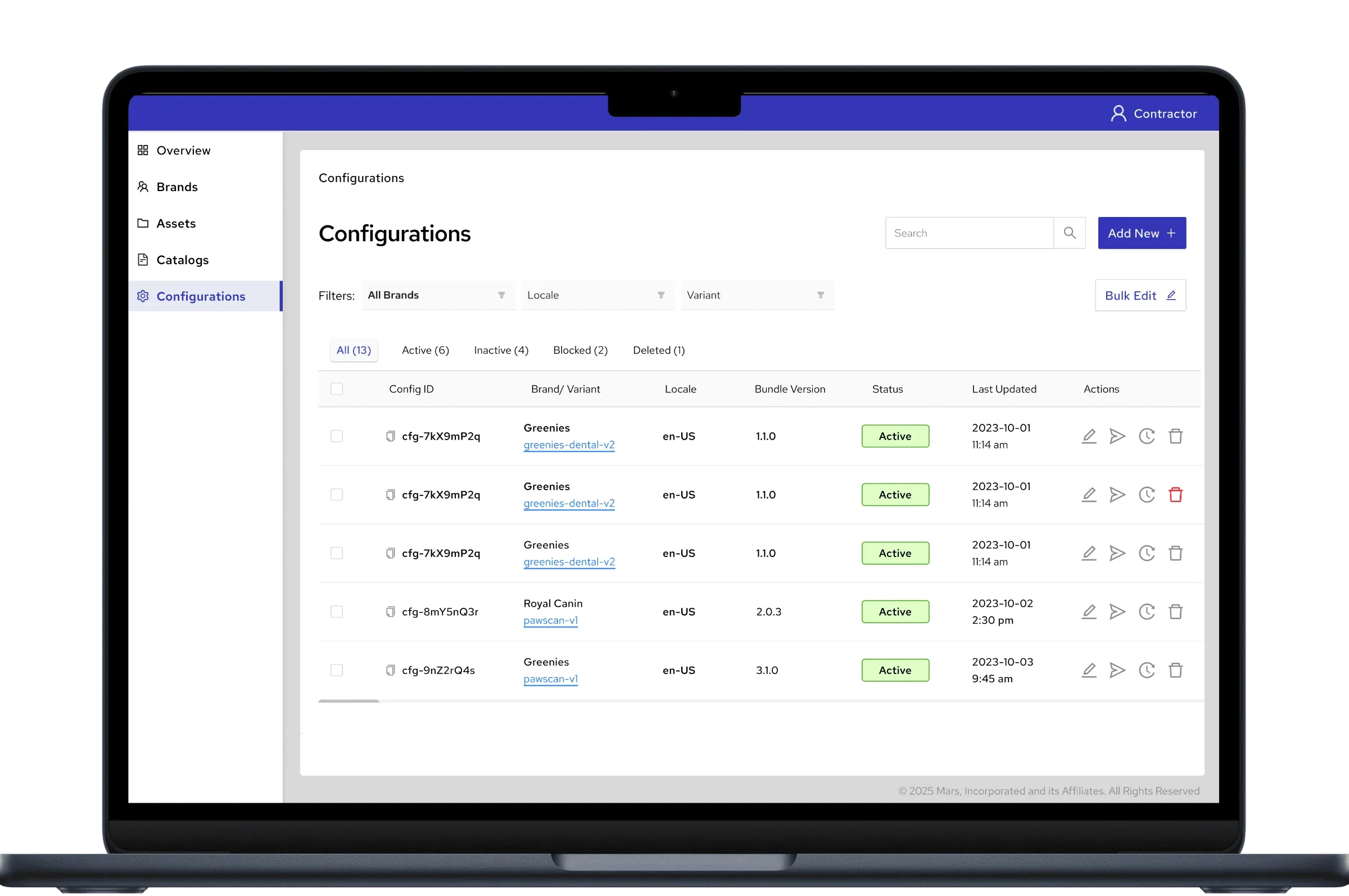
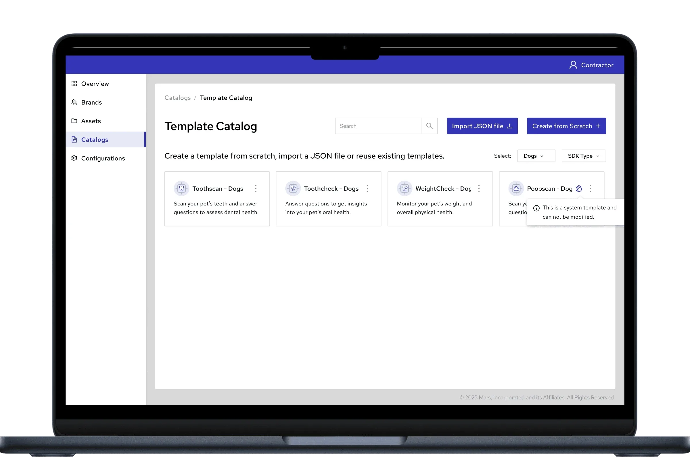
Template creation (including import from JSON), the catalogs, configurations and validation across flows, and configuration history with restore.