Pet Health Scan Suite
Finding out why pet owners abandon an AI dental scan, across around 15 white-label health-check tools on around 10 pet-brand websites.
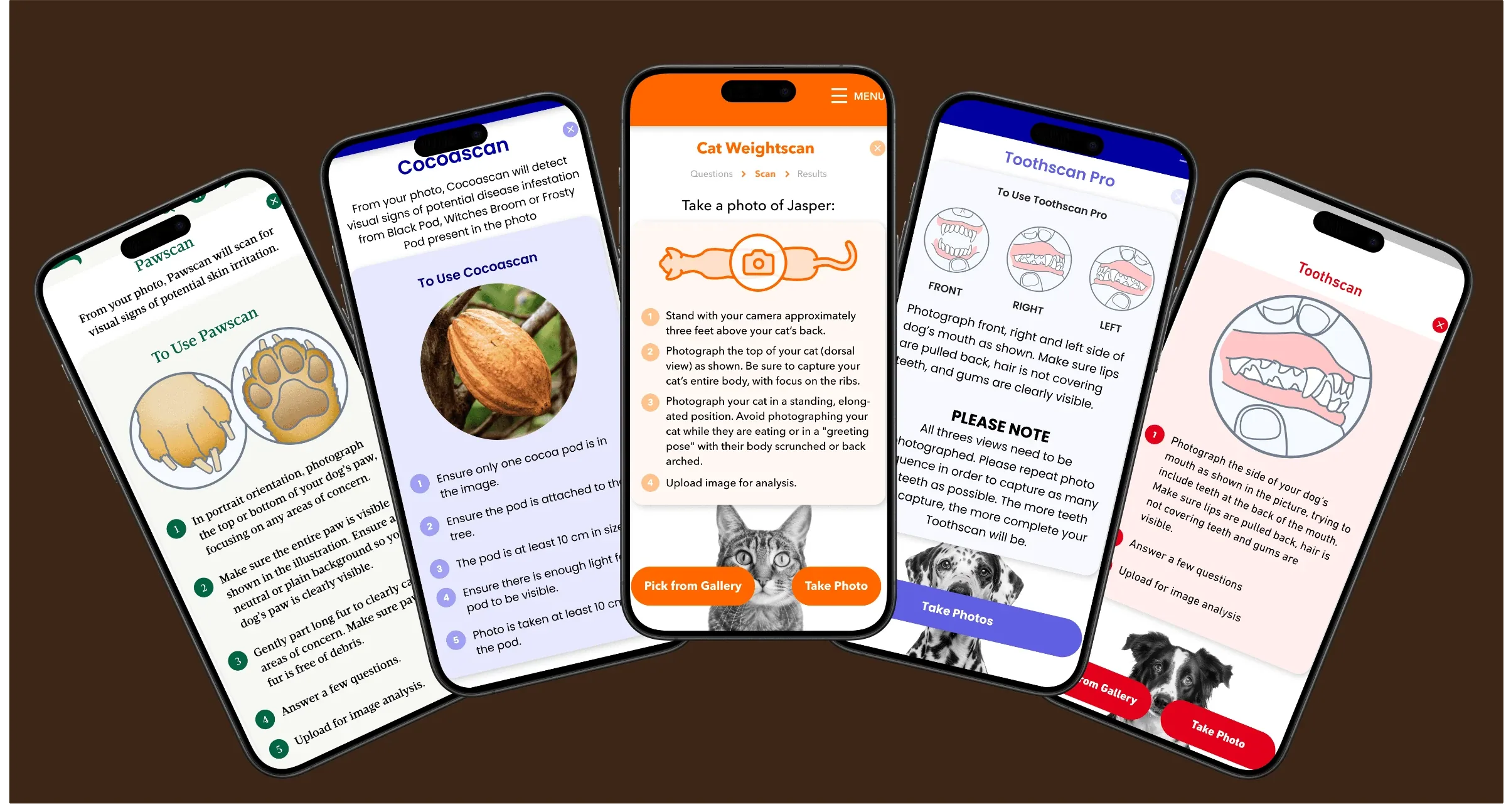
What it is. A white-label suite of AI health-check tools that pet brands embed on their own websites. There are tools for teeth, skin, weight, fleas and more. A pet owner takes a photo of their dog or cat, answers a few questions, and gets a plain-language result with next steps.
What it's for. Guidance, not diagnosis. The tools help owners spot problems early and decide whether to see a vet. They don't replace one. For most people the flow ends at the result. Signing up and chatting with a live vet are there, but secondary.
Who uses it. Pet owners who find a tool on a brand's website, mostly on their phones.
Where it's built. The tools are built and branded in SDK Manager, the internal no-code platform in my other case study. The tool is ours to change. The brand's website around it is not.
A tool only helps if someone gets to the end. An owner who leaves partway gets no result and no guidance.
The senior designer owned the client relationship, the research, and the base flow every tool shares. I worked within that flow. My own work was:
- the drop-off investigation, from hypotheses to shipped feedback forms
- the immunity check's decision tree and results redesign
- UI changes across tools, and one new tool
- developer specs
- font naming and brand libraries for theming
What the data showed
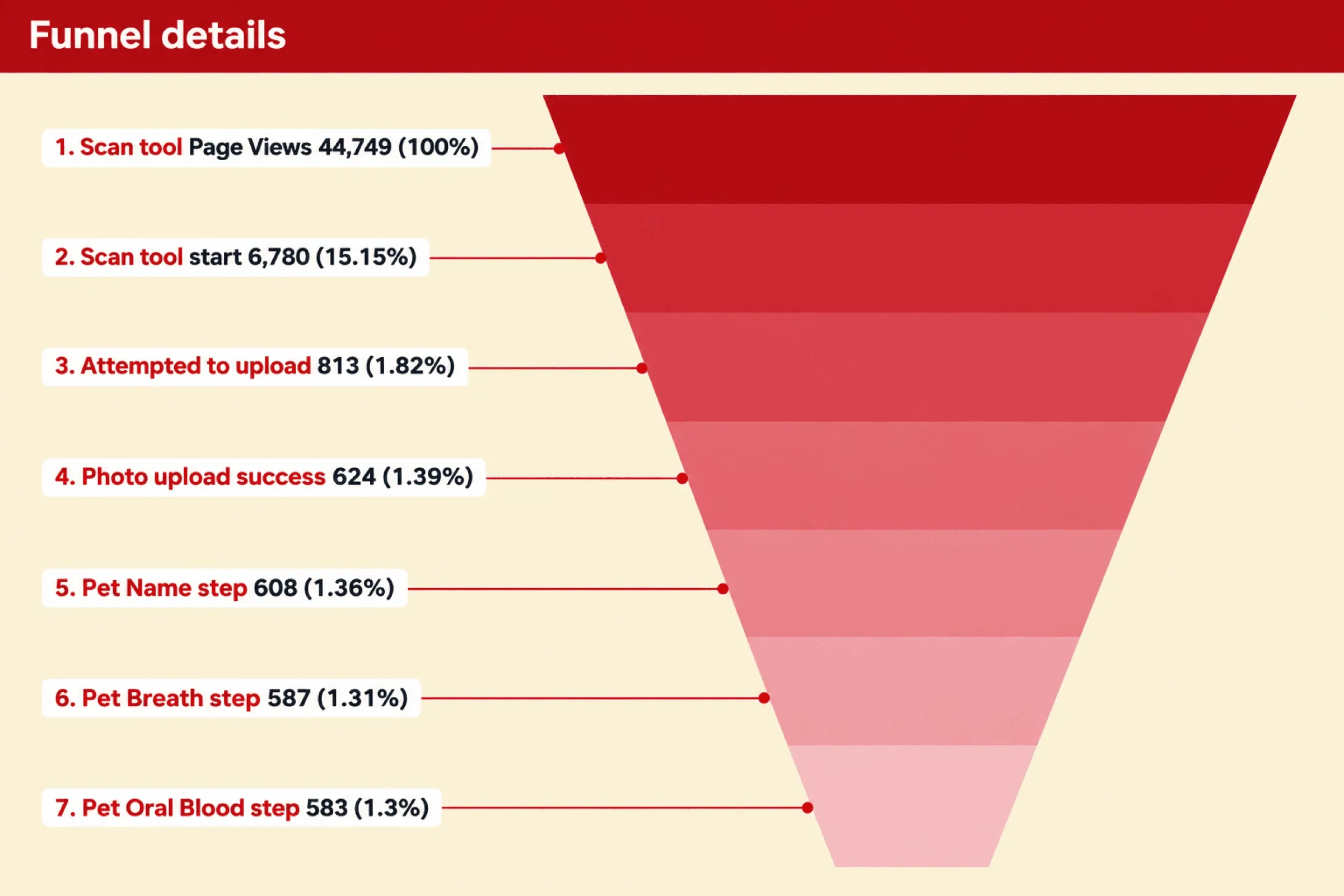
The 189 uploads that failed (23%) were photos the AI rejected, because they didn't follow the photo instructions or weren't the right kind of image. Once a photo was in, almost everyone finished. The analytics showed where people left, but not why.
Six assumptions
Every reason I could think of for the drop.
Four ideas, one kept
I designed a fix for each group of guesses. Three were mocked up and set aside: one parked, two dropped.
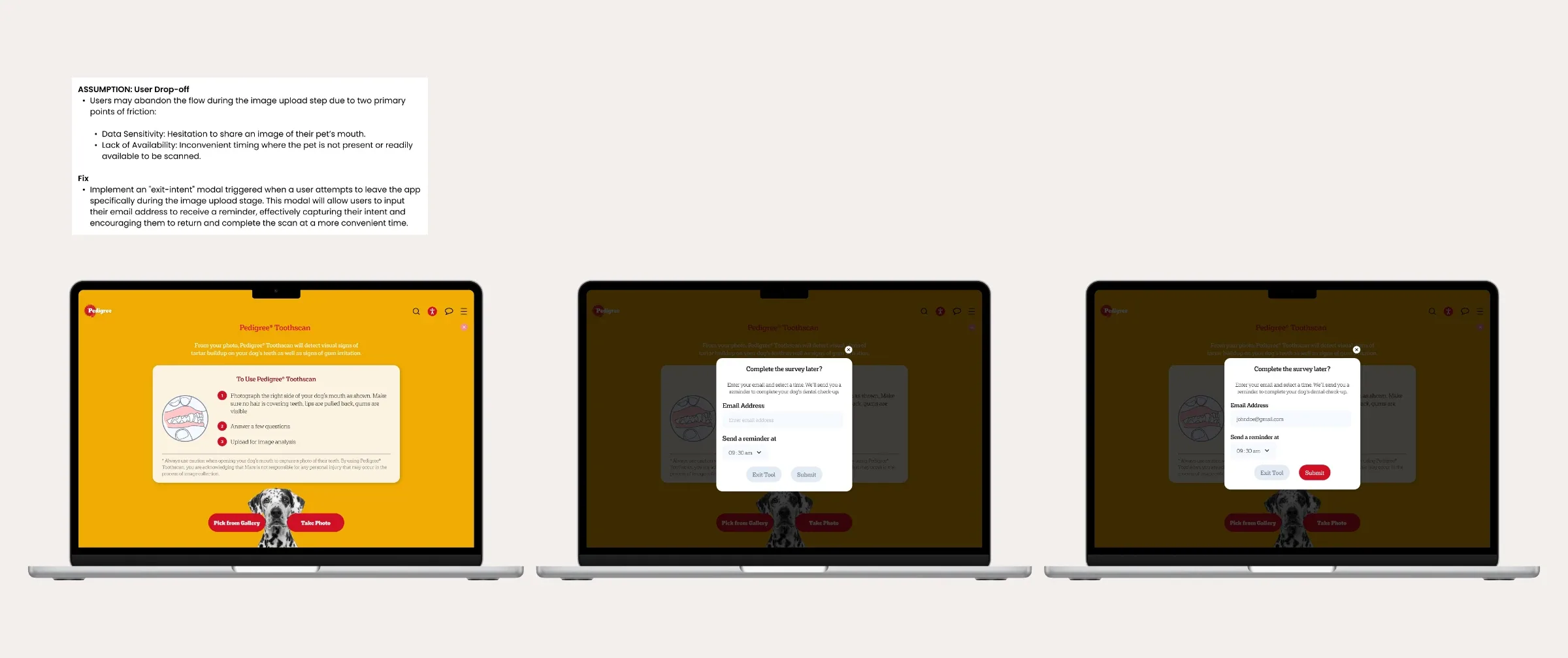
A reminder email
Aimed at: The dog isn't there, the owner is busy, or they were only exploring.
When someone leaves at the photo step, let them enter an email and a time to be reminded to finish. Storing emails needed a new backend database, connected to every brand. Too much build for a guess.
Banner redesign
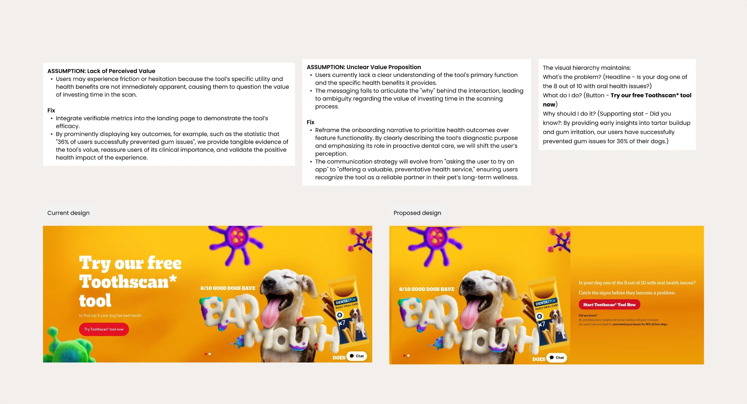
Aimed at: Benefit and purpose of the tool unclear.
A problem-led headline ("Is your dog one of the 8 out of 10 with oral health issues?"), a clear Start button, and a supporting stat from the brand's own site. The banner belongs to the brand, and we couldn't change it.
Landing page redesign
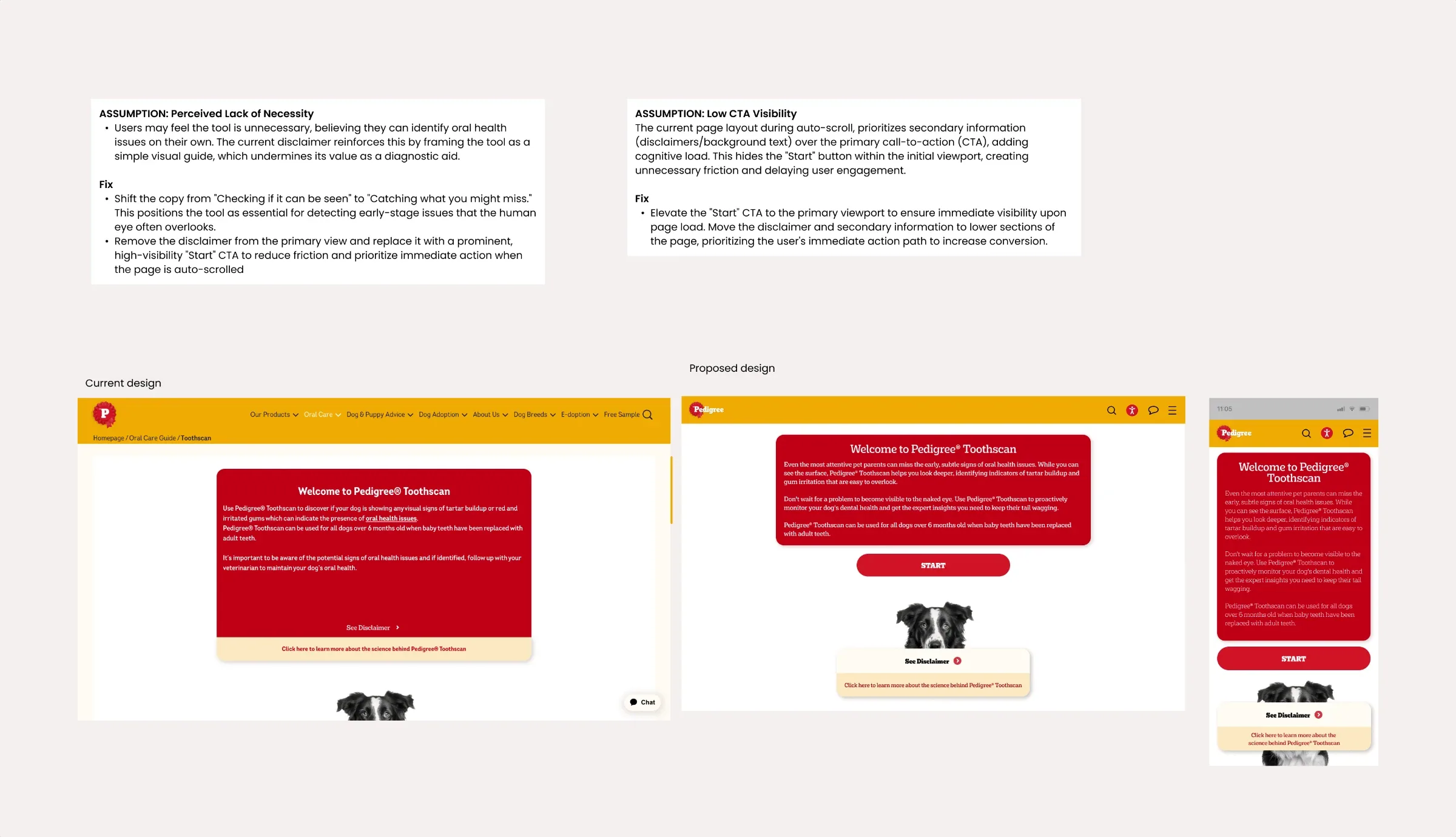
Aimed at: Tool not necessary, Start hard to find.
Start moved into the first screen, copy reframed around catching problems early, disclaimer moved lower. Each brand owns its landing page. It couldn't be changed from the tool's side, and 10 brands wouldn't all agree to the same change.
So the fourth idea was to ask first
Each of these bet on one guess being right, and each needed either new backend work or sign-off from every brand. So the fourth idea was to find out which guess was true first, with something that fit inside the tool.
What I designed
Two short forms: one when someone leaves partway through, and one when they finish.
When they appear. The leaving form appears when someone taps the tool's close button, navigates away, or closes the browser tab on desktop. The finishing form appears after a scan is submitted, on selected result screens, or while browsing Additional Resources.
Not asking twice. Each person sees the form once per session. It only returns if their cookies are cleared or expire, and the cookie duration can be configured per brand.
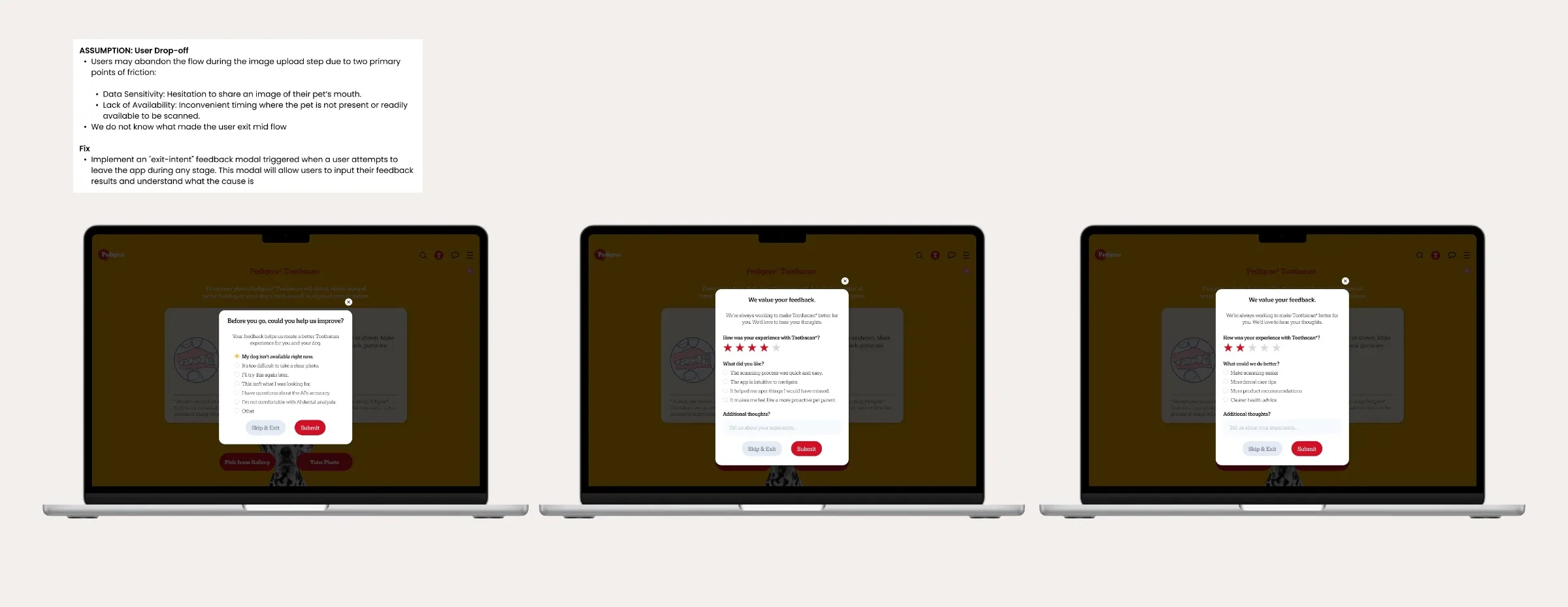
Leaving partway: one question, seven one-tap reasons
The same form appears wherever someone leaves. The client's legal team set the seven reasons, so the wording isn't mine. I designed the form around them and mapped each reason to the guess it tests.
Finishing
A star rating, then one question whose options depend on the rating: short statements for 1 to 3 stars, more detailed ones for 4 to 5. The comment box is optional.
Cheap to answer, easy to leave
- One question, one tap, no answer selected by default.
- Skip & Exit sits next to Submit.
- The form closes in one click.
Result
The forms shipped in August 2026. I moved off the project the following month, before enough responses had come in, so I don't have the results. Success was to be measured by how many people answer instead of skipping, and by which reasons come up most. Before I left, I set out what each leading reason should lead to, in some cases back to an idea that was dropped:
- "My dog isn't available right now" or "I'll try this again later" → the parked reminder email, this time with evidence to justify the backend work
- "It's too difficult to take a clear photo" → better photo guidance before the upload step, which would also cut the 23% of uploads that get rejected
- "This isn't what I was looking for" → the banner and landing page copy
- AI accuracy or comfort → clearer explanation of how the AI works and what it's for
Making a 10-outcome result readable
Most scan tools follow one path. The immunity check's result depends on several answers: sex, neutered or spayed, pregnancy or breeding plans, and existing symptoms.
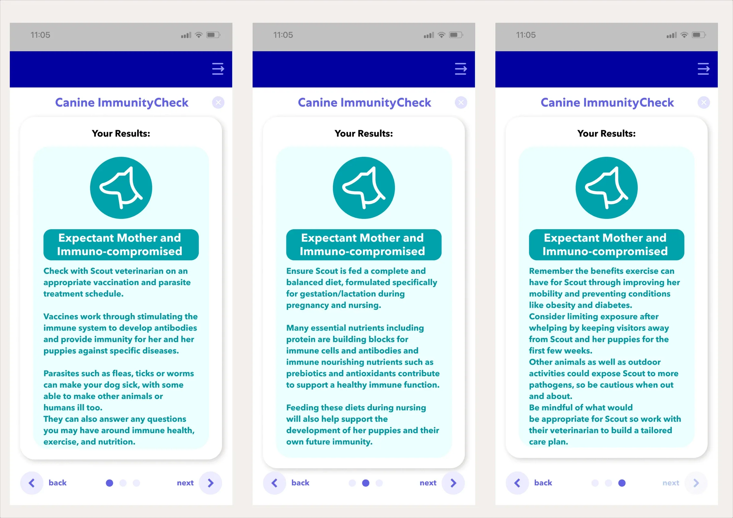
Those combine into ten possible results. The result is where an owner learns what's going on with their pet, what to do about it, and whether to see a vet. Each result was written as long paragraphs spread across three swipeable pages. Nothing stood out, and anything on pages two and three was easy to miss.
Mapped the logic. I drew the full decision tree, every combination of answers and the result it leads to, so the branching was explicit for developers and QA.
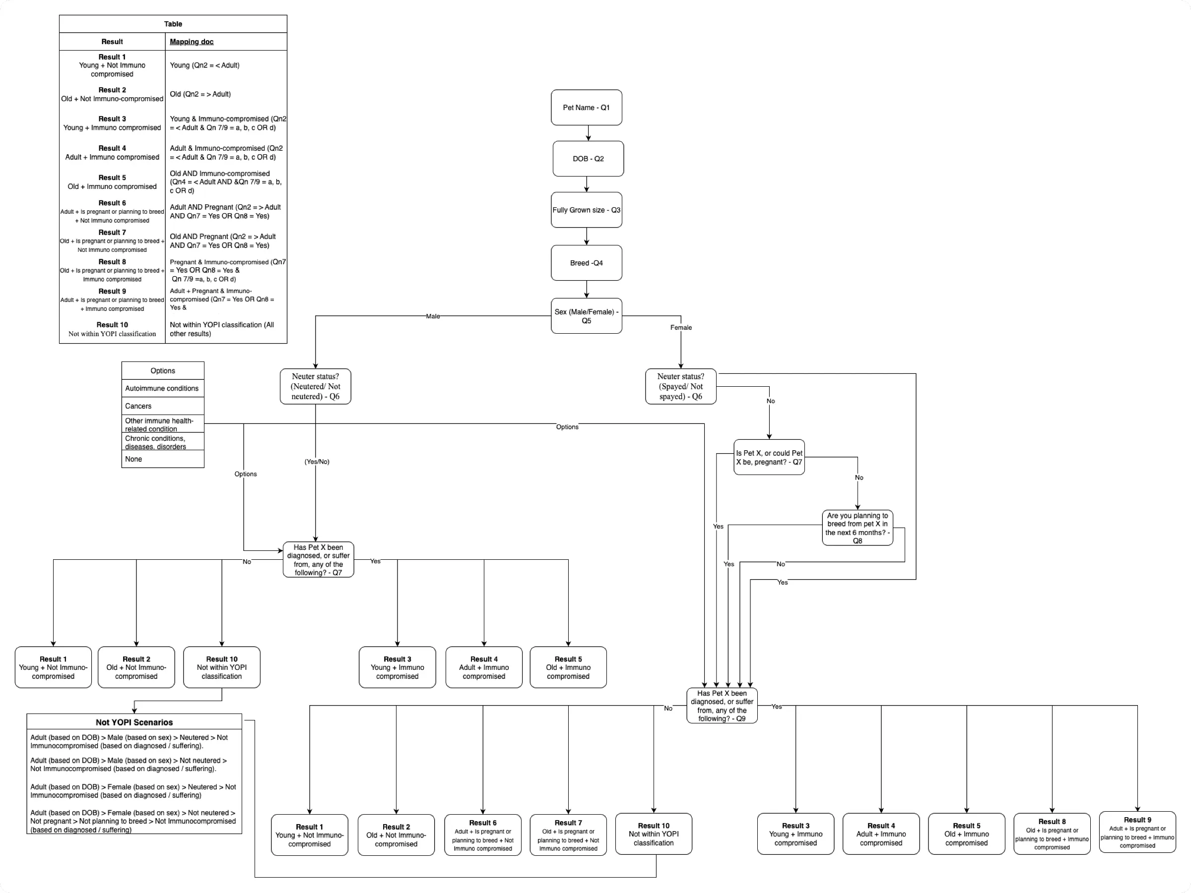
Labels, still across three pages
Bold labels on each tip (Consultation, Vaccines, Diet) made points easier to find, but owners still had to swipe through three pages.
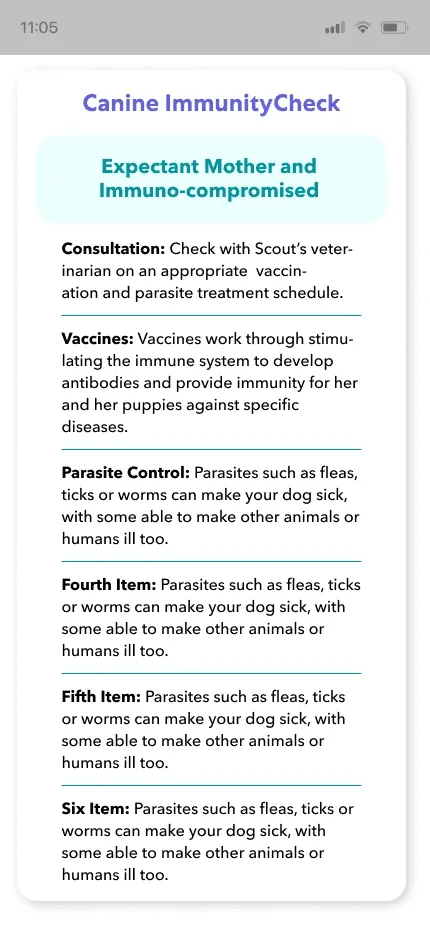
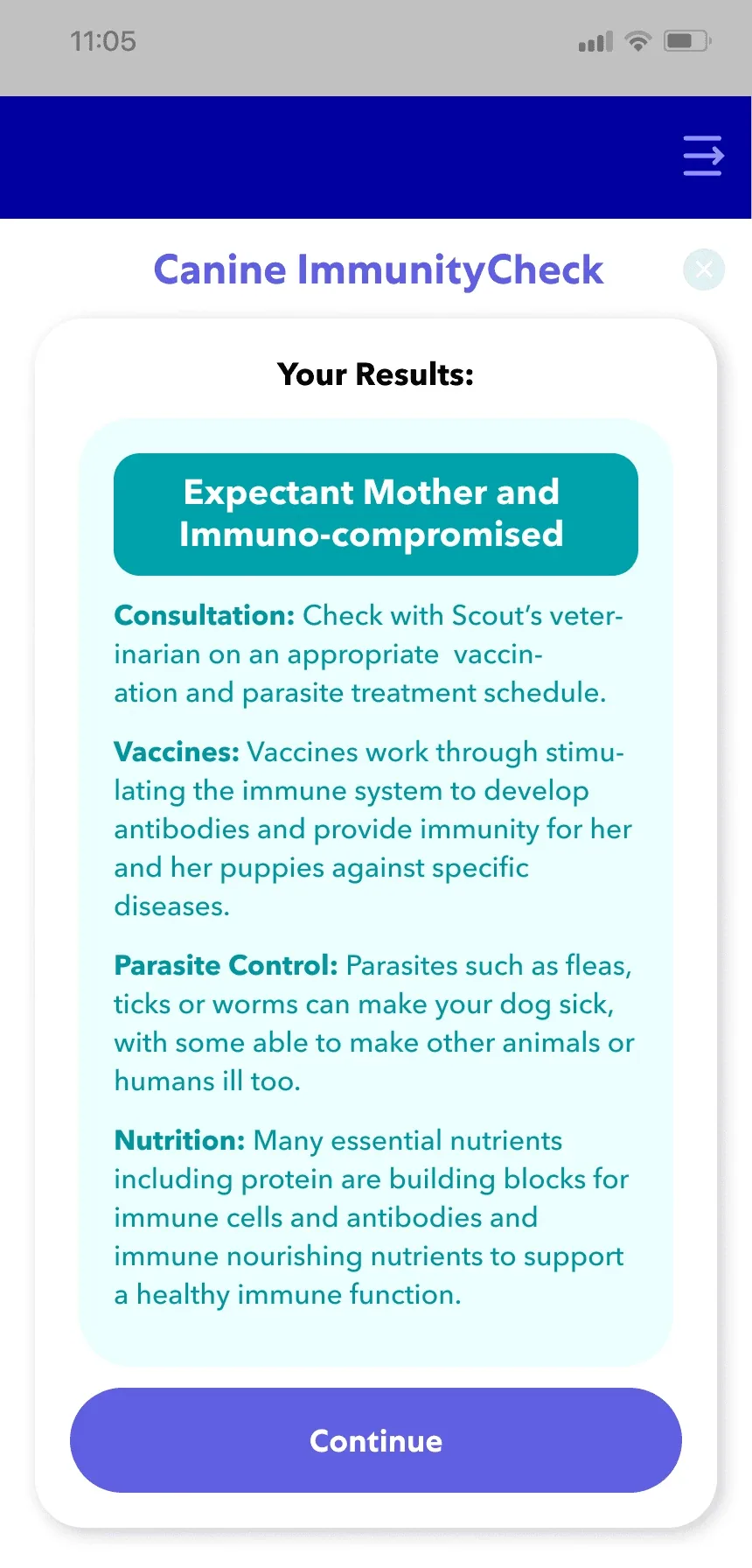
One card per tip, one scrolling page
No more swiping, but the client didn't want scrolling on result screens. Every other tool shows results as carousel cards, and they wanted this one to feel the same.
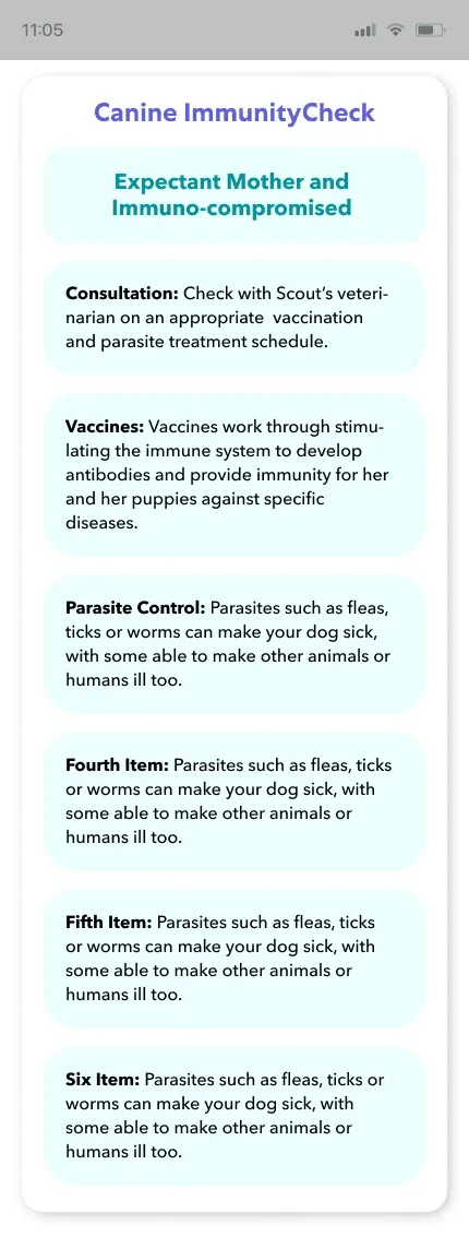
Everything on one card, no scrolling
The content had to fit one card. I kept the key tips with bold labels, put the vet consultation tip first, and linked the full list of tips on the brand's website. Drag to compare.
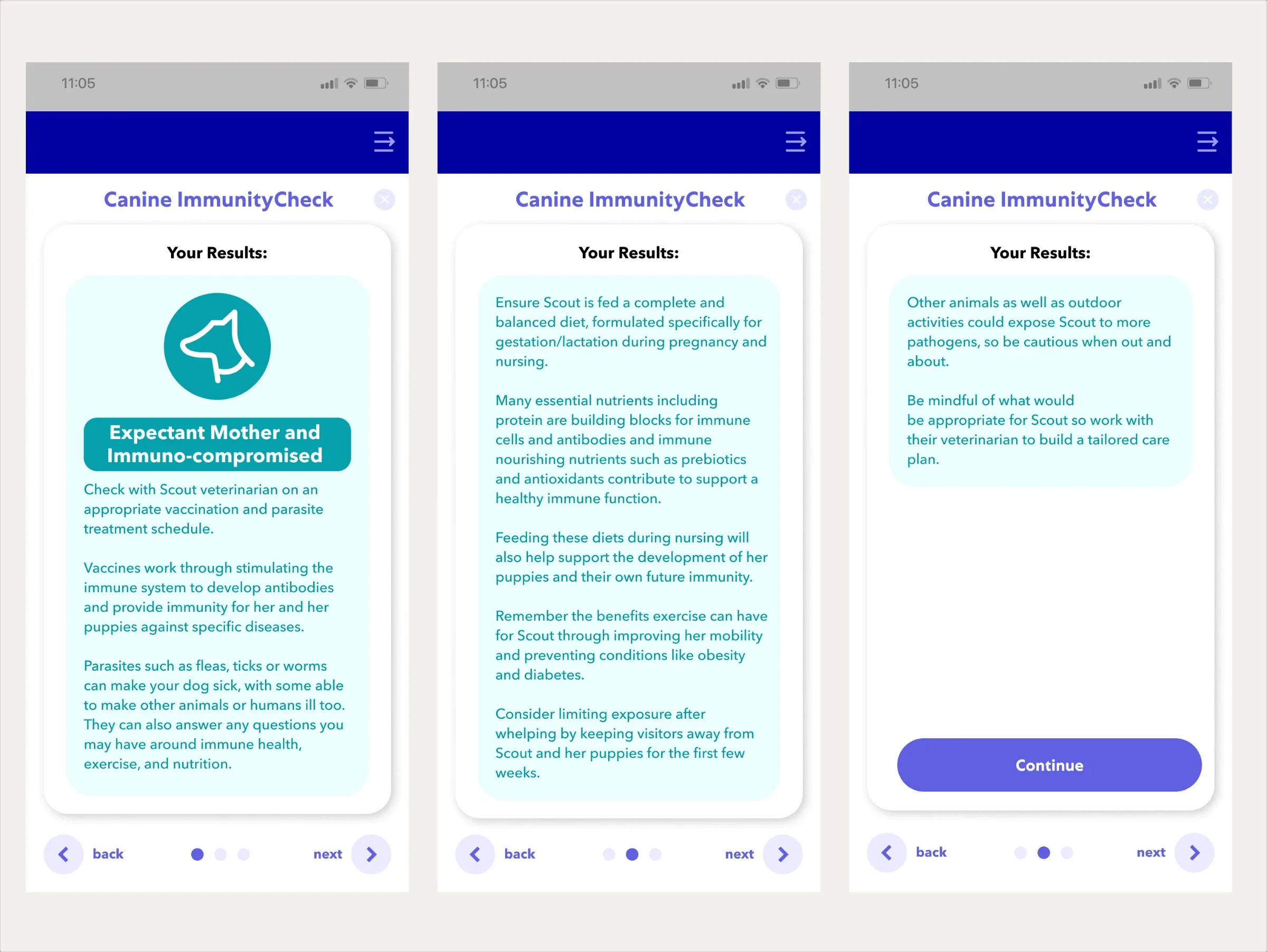
pages per result
Shipped. Each of the ten results now fits on one card instead of three pages. The layout was chosen with the client, within the client's carousel format.
Re-skinning a tool for a new brand
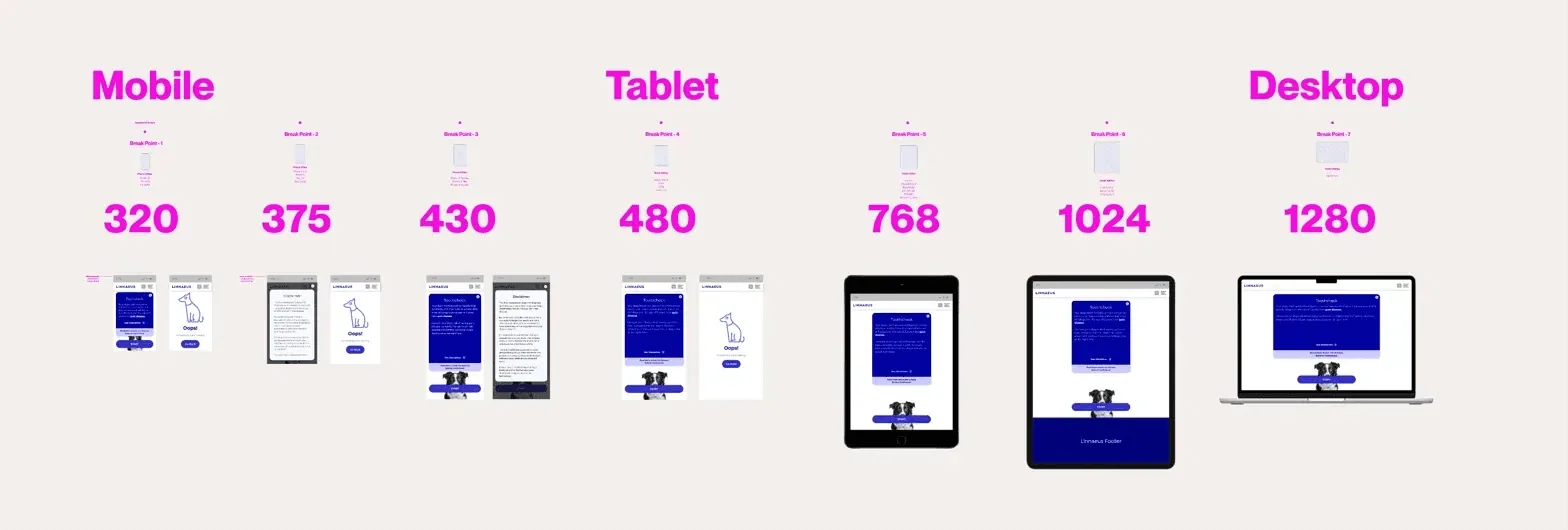
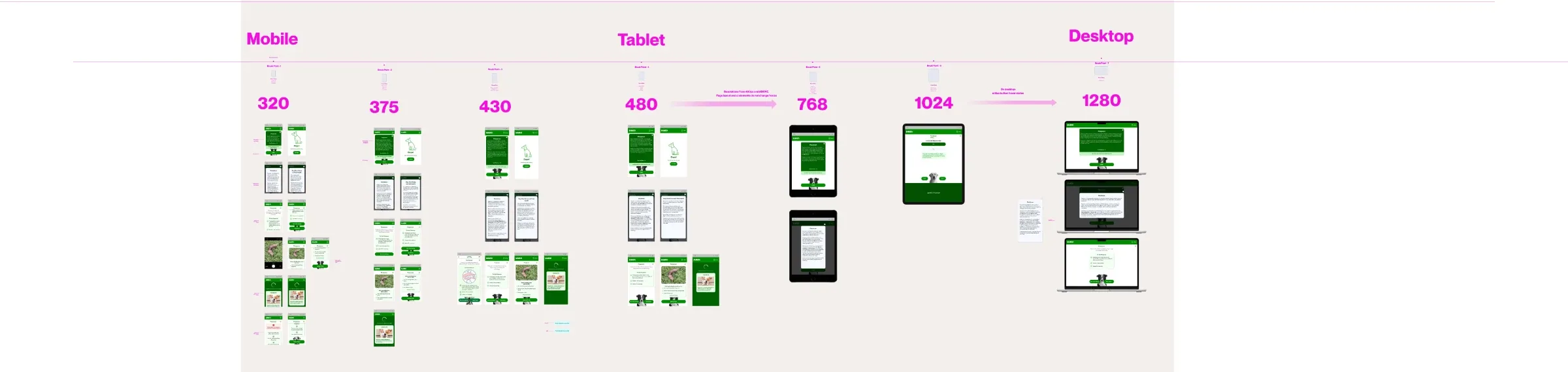
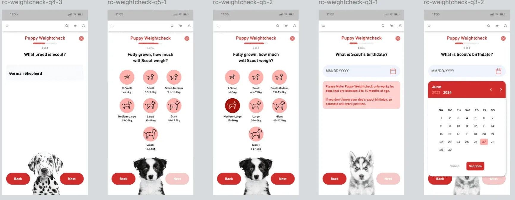
Each tool runs on around 10 brands, each with its own colours and fonts. Re-skinning a tool's design files for another brand meant changing colours and text styles by hand, which I estimate took about two days per tool.
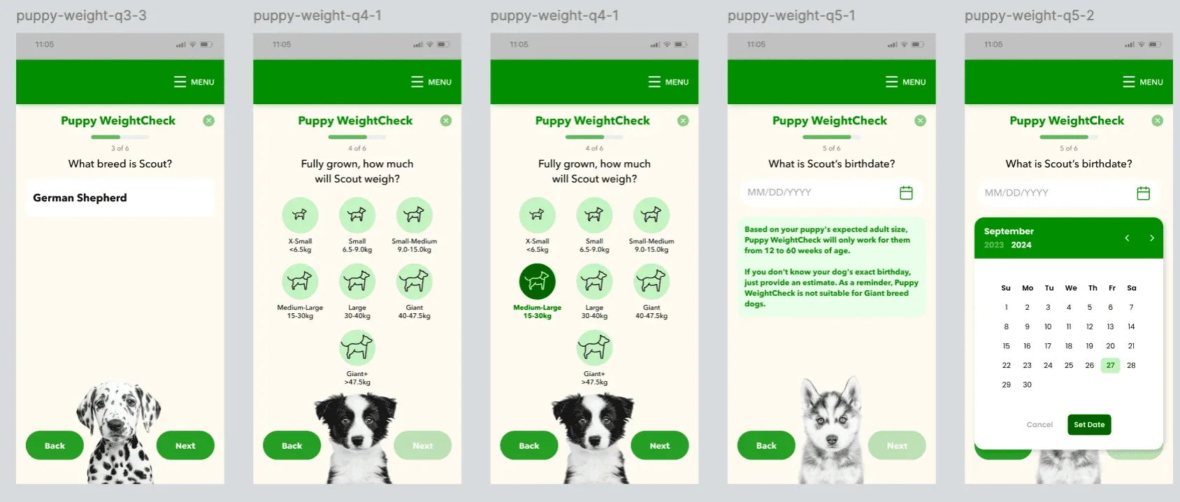
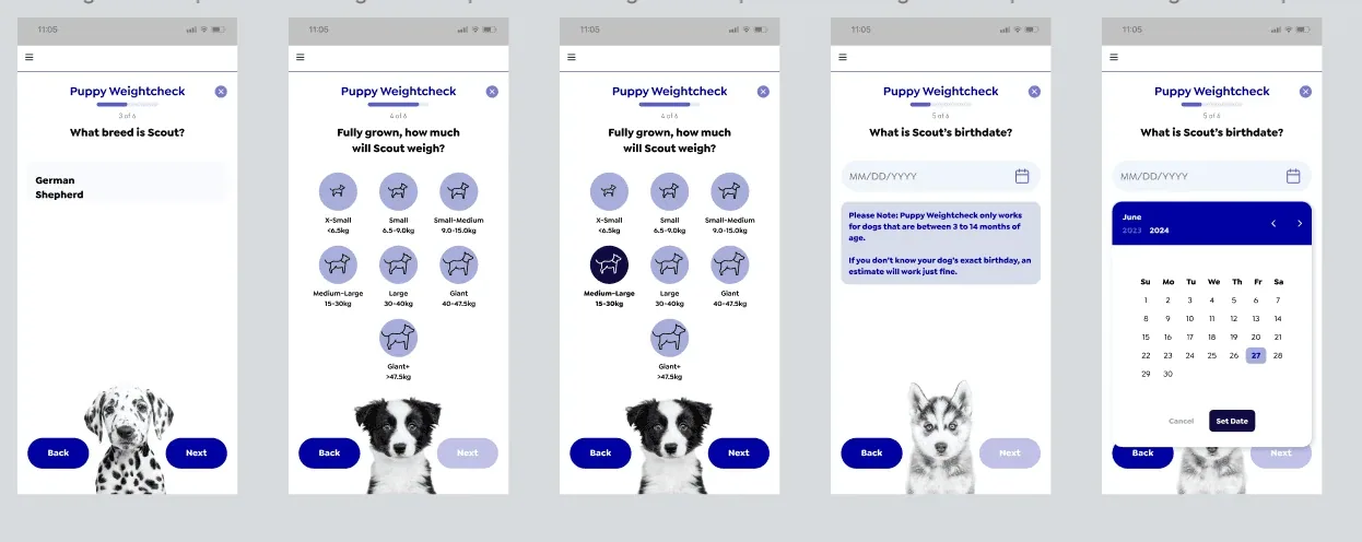
- Consistent names. Colour roles follow the client's fixed mapping. I named the font styles so every tool uses the same names for the same roles.
- One library per brand. Each brand's colours and fonts live in one Figma library. Swapping the library re-skins a whole tool at once, because the names match across brands.
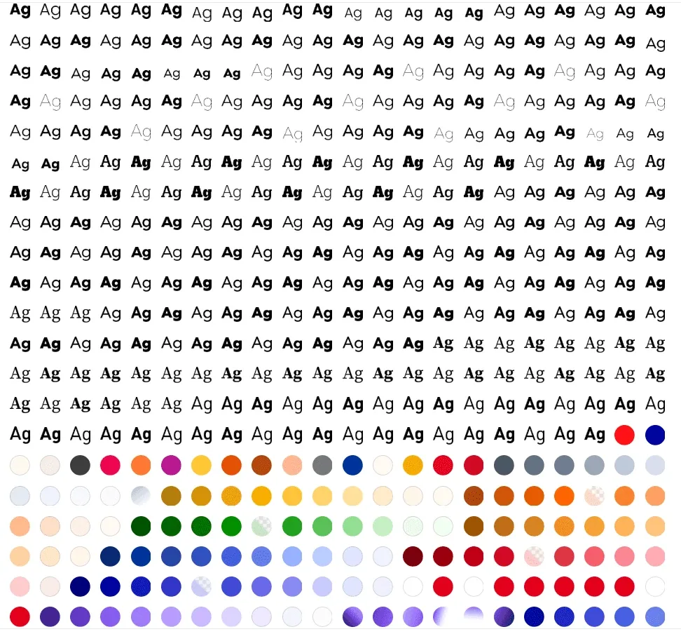
Brands with one colour
Some brands supplied a single colour. I generated a full set of tints from it with a plugin, so every colour role in the tool was still filled.
Setting up a new brand's library takes 10–15 minutes, to define its font styles and colours. After that, re-skinning a tool's design takes a minute or two instead of about two days, and the same library re-skins every tool.
Used for real. I re-skinned 12–13 tools this way, across 3–4 brands.
Other work on the suite
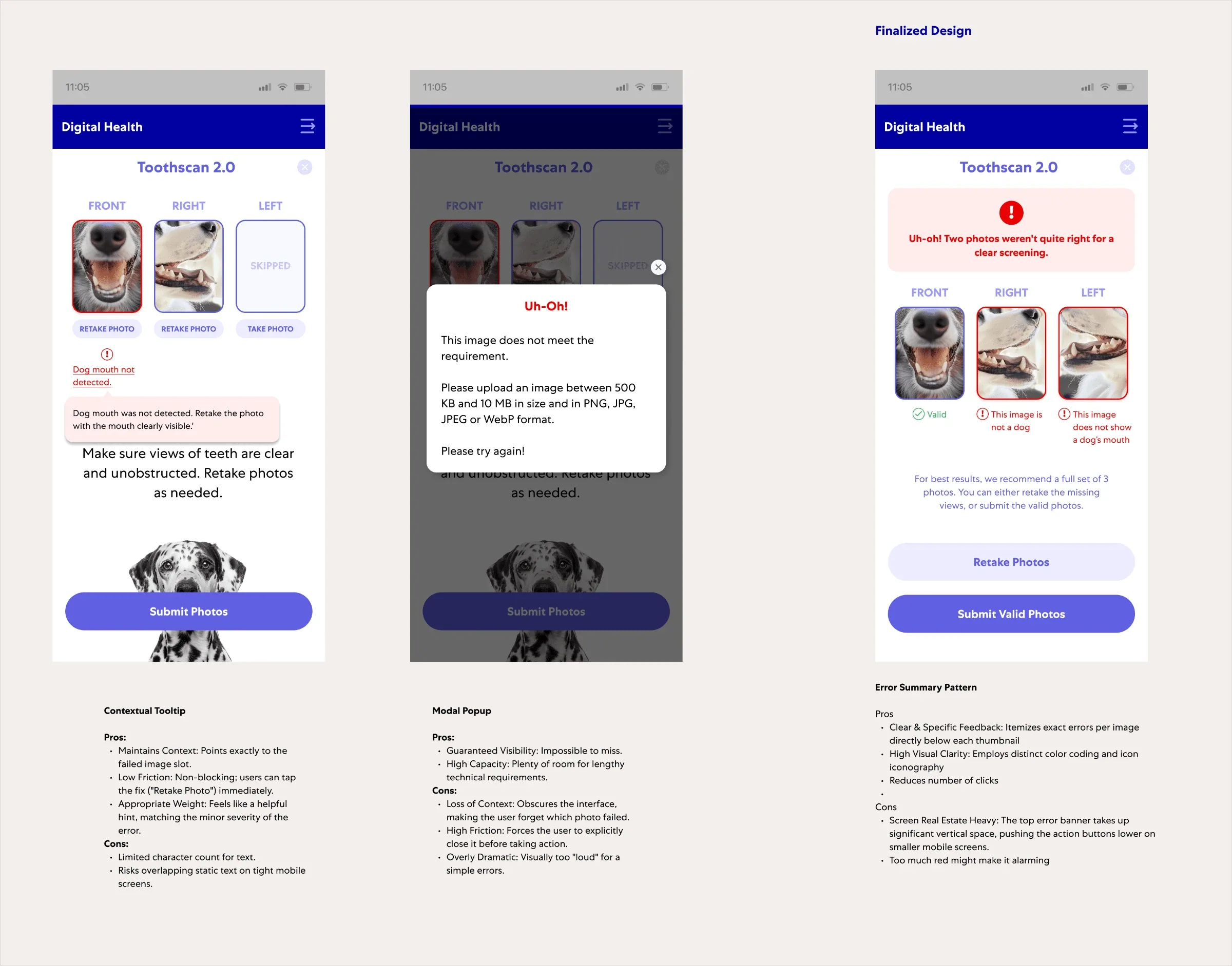
- Multi-photo errors. One tool needs three photos from different angles, so I designed an error for each photo that points to the one that failed.
- Developer specs. For my screens, and one new tool built on the existing flow.